Competitor Tracking: Price Changes Are 5% of What Actually Moves
You bought the tool for the price alert. The story sells itself: a competitor drops their price on a Tuesday, you find out on the Wednesday instead of mid-demo three weeks later, and the deal survives. It is the demo that sells the category, and the first item on most feature lists.
Then the alerts start arriving, and almost none of them are about price. We classified 155 real change alerts from 71 monitored competitor websites by what actually changed. Price changes were 5.2% of them. Content changes were 65.8%, and positioning or messaging changes another 23.2%. This is what that mix looks like, why the published research appears to say the opposite, and how to decide which changes are worth anyone's attention.
Key Takeaways
- Across 155 classified alerts from 71 monitored competitor websites, price changes were 5.2%, content changes 65.8% and positioning or messaging changes 23.2%.
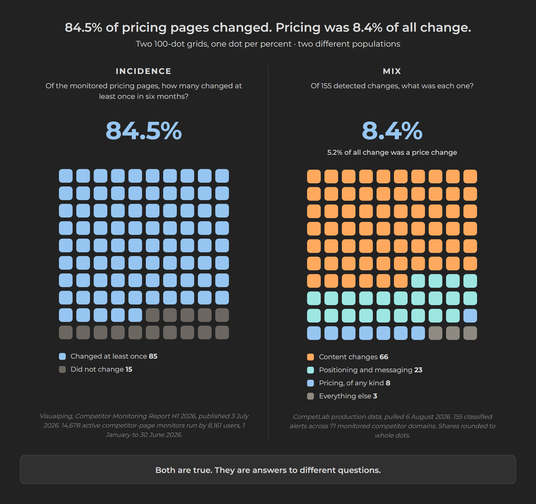
- Two measurements get confused. How many monitored pricing pages changed at all: 84.5% did in six months. What share of all detected change was a price change: 5.2%. Both are true, and legal and terms pages changed slightly more often than pricing pages did.
- A pricing page is not a price: five of our eight price alerts were one company re-presenting its own billing, flipping between monthly and annual display.
- Within the page types we can classify - about a sixth of all page movement - competitors added 2,935 more documentation pages than they deleted while deleting 454 more blog pages than they published.
- Positioning changes travel badly. An audit of 47 repositioned companies found 41 still had a public surface telling the old story a median 21 months later.
- Score every alert by consequence before it reaches a person: three categories, a named artifact each one must change, and a monthly kill list for alert types that never led to an action.
What does competitor tracking actually catch?
Words, mostly. Across 155 classified change alerts from 71 monitored competitor websites, content changes were 65.8% of everything detected and positioning or messaging changes another 23.2%. Price changes were 5.2%.
That is the whole finding, and the rest of this article is what follows from it.
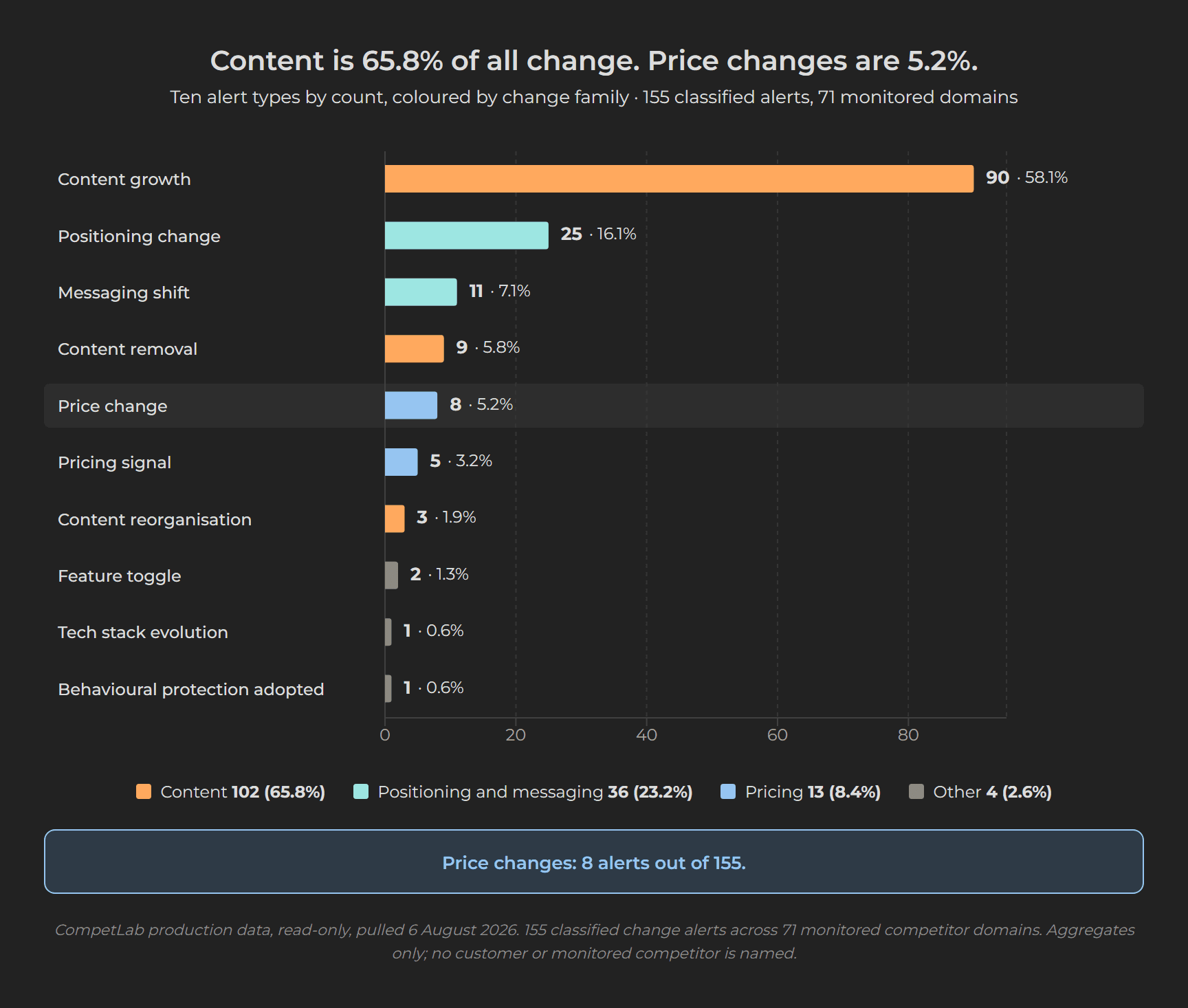
Here are the same 155 alerts broken down by the exact type our system gave each one. We sort every detected change into one of ten types rather than just recording that a page came back different, which is the only reason a breakdown like this can be printed at all.
| Change type | Alerts | Share |
|---|---|---|
| Content growth | 90 | 58.1% |
| Positioning change | 25 | 16.1% |
| Messaging shift | 11 | 7.1% |
| Content removal | 9 | 5.8% |
| Price change | 8 | 5.2% |
| Pricing signal | 5 | 3.2% |
| Content reorganisation | 3 | 1.9% |
| Feature toggle | 2 | 1.3% |
| Tech stack evolution | 1 | 0.6% |
| Behavioural protection adopted | 1 | 0.6% |
A "pricing signal" there means something around price moved without a number changing: a plan renamed, a billing toggle added, a discount line altered. Content of all kinds - growth, removal and reorganisation - is 102 alerts, 65.8%. Positioning change plus messaging shift is 36 alerts, 23.2%. Everything pricing-shaped, including those five softer signals, is 13 alerts, 8.4%.
The sample is small and you should treat it as directional. These are 155 alerts across 71 competitor domains, watched on behalf of 24 organisations, pulled on 6 August 2026. They cluster in a handful of niches. This is one tool's view of one set of markets, not a measurement of the software industry. We are publishing it because, as far as five research passes could establish, nobody else publishes this cut at all.
And across 335 comparisons of those 71 domains' sitemaps - the machine-readable list of every page a site publishes - not one came back unchanged. Every competitor moved, every time we looked. That figure means what it appears to mean: the system writes a record on every scheduled check, whether it finds a difference or not, so 335 of 335 is a real result rather than an artefact of only storing the interesting ones.
If price changes are 5%, why does everyone report constant pricing changes?
Because those are two different measurements, and almost nobody separates them. Call the first one incidence: out of everything you watch, how much of it ever changed at all. Call the second one the mix: out of everything you caught changing, what share each kind of change was. Incidence is the number the industry publishes. The mix is the number that tells you where to look.
Start with incidence, because there is a surprise buried in it. Over six months, 84.5% of monitored pricing pages changed at least once. Legal and terms pages changed on 85.2%.
| Page type monitored | Share of monitors on that page type that saw at least one change |
|---|---|
| Investor relations and filings | 91.3% |
| Blog, news and press | 85.2% |
| Legal and terms | 85.2% |
| Pricing and plans | 84.5% |
| Social profiles | 80.5% |
| Homepage and top-level pages | 77.8% |
| Product and changelog | 76.3% |
| Docs and API | 75.6% |
| Careers and hiring | 73.5% |
Pricing pages are not the most volatile thing on a competitor's website. They are fourth, behind investor relations, press and the terms of service. Nobody would read 85.2% and conclude that legal-page edits are the strategic signal of the year, and nobody should read 84.5% that way either. A detection rate tells you a page moves. It tells you nothing about whether the movement meant anything.
Those figures come from the H1 2026 report of Visualping, a website-change monitoring service, published 3 July 2026. Its sample is 14,678 active monitors run by 8,161 users between 1 January and 30 June 2026, where one monitor is one page a customer asked the tool to watch. Across all 14,678, 77.5% saw at least one change.
A second vendor lands in the same range. IndustryLens, a competitive intelligence platform for B2B SaaS, reports that 83.1% of the 154 competitors it monitors changed a pricing page at least once between December 2025 and August 2026 - and, on the same page, that 50.6% rewrote messaging or positioning in a given week. Their own data has messaging moving about as often as pricing.
Treat both cautiously. The whole incidence picture is one vendor's customer base, corroborated by a second vendor whose figure is self-described as "computed live; refreshed daily" and has read 93.2% and 79.2% at other points this year. Neither is a market measurement. They are the best public numbers that exist, which is a different claim.
None of these numbers is in conflict with 5.2%. A page can change every month while the decision behind it changes once a year.
A pricing page is not a price. Pages carry plan names, feature bullets, FAQ blocks, trust badges, currency toggles and annual-versus-monthly switches, and all of those move without a number moving. Our own eight price alerts make the point uncomfortably well: five of the eight were a single domain re-presenting its own billing, flipping between monthly and annual display. Two of the rest were substantive price moves. That is why this article quotes the share and never the prices.
The chart below draws both measurements side by side. Its right panel uses the broader 8.4% - everything pricing-shaped, the eight price changes plus the five softer signals - because that is the fairest version of the case against us. Price changes alone are 5.2%. Neither number changes the shape.
What you monitor decides what you find
The published record on competitor change is almost entirely pricing-shaped, and that says more about where people point their monitors than about how competitors behave. Studies count pricing-page changes because pricing pages are the pages people watch. Watch only those and you will report, accurately, that pricing changes constantly.
One fact cuts hard against the assumption that the category itself is price-first. Semrush Competitor Monitoring lists what it alerts on in this order: newly published blog posts, recently launched Google Search Ads, new pages across competitor websites, new Facebook and Instagram posts, social engagement trends. Pricing is not on the list at all. One of the best-known names in the category built its competitor monitoring around content and advertising, and left price out.
The gap is not that vendors only sell price alerts. It is that price is the demonstration, the first item in the list, the example in the product tour, and very nearly the only change type anyone has published numbers on. Across five research passes we could not find a single published distribution of competitor changes by type, from any vendor, analyst, agency or academic. Plenty of incidence, including the two datasets above. No mix.
What do the quiet changes actually look like?
Like copy edits. That is precisely what makes them hard to catch and easy to dismiss when you do. These are the recurring patterns behind the 49 alerts classified as positioning, messaging, price or pricing signal, described without naming the companies involved.
| Pattern | What changed | Why a price monitor misses it |
|---|---|---|
| Audience broadening | An observability platform moved its audience line from a specific operational context to a broad era-based framing | A market-size move written as a copy edit |
| Segment shift | A monitoring vendor replaced a two-word named enterprise segment with one generic noun | Two words, and a different buyer |
| Product-branding retreat | A customer-success platform replaced its AI-agent product branding with a wider experience category | A roadmap signal hidden in a nav label |
| Bundle expansion | An incident-management vendor folded two previously separate paid products into the core bundle | Scope grew, price did not move |
| Packaging surfacing | A geo-targeting vendor promoted a pricing-tier section onto its homepage | Packaging emphasis, not a price move |
| Value-prop compression | Several vendors tightened hero copy from feature lists to one benefit claim | The differentiator itself moved |
| CTA strategy shift | Several vendors changed primary and secondary calls to action together | A change to the conversion model |
Take the segment shift. Replacing a named buyer segment with a generic one is a decision to sell to somebody else. It shows up as two words on a homepage, and a monitor watching for numbers on a pricing page will never see it.
These changes travel slowly, which is the part that has changed
A rewritten homepage used to be a thing your buyers saw or did not see. Now it also feeds the systems that answer their questions, and the slowest part of those systems is very slow indeed to let go of the old story.
SandsDX, an AI-visibility research firm, audited 47 B2B SaaS companies that renamed, rebranded or publicly changed category between January 2024 and October 2025, all of them public, PE-owned or late-stage. Published 21 July 2026. A median 21 months after the announcement, 41 of the 47 still had at least one major public surface telling the old story.
The breakdown is the instructive part. 89% had updated their own LinkedIn description. Only 29% of their Wikipedia leads carried the new story, and 40% of their profiles on G2, the software review site, did not lead with the new positioning. Companies update what they control and lose the rest. Not one of the 30 companies that repositioned without changing their name ended up with a fully synced public story.
Three of the four surfaces they checked were pages a person reads. The fourth was not: they asked an AI model what each company does. It was one model, Claude, with its web access switched off. Roughly one in seven of the 47 came back described purely as the thing the company had spent millions to stop being. A further 29 got a mixed answer, old category first and the new story as a trailing clause. That leaves eleven that came back clean.
Switching the web access off is the point. It makes this a probe of what the model absorbed during training, not of what a buyer sees in a browsing assistant today. It is the slowest layer, and the slowest layer is the one a rewritten homepage cannot reach at all.
For a competitor tracking programme that is a practical instruction. The homepage tells you what a competitor decided. The third-party surfaces tell you what buyers are still being told. Those are different facts and you want both. Keep the AI part of it in proportion, though: what a model carries in its training weights is a slow, second-order layer, and the fast, controllable one is what an engine retrieves live. We have argued that at length elsewhere, and nothing here changes it. We have written separately about how to measure what AI systems say about a brand and about what an AI competitor list is actually describing.
Where the content is going
The same 335 comparisons show which pages competitors added and removed. Read the last row first, because it decides how much the others are worth: most page movement lands in a bucket our classifier cannot name, and it is bigger than everything it can.
| Page type | Pages added | Pages removed | Net |
|---|---|---|---|
| Documentation | 3,222 | 287 | +2,935 |
| Landing pages | 318 | 28 | +290 |
| Comparison pages | 71 | 36 | +35 |
| Case studies | 36 | 24 | +12 |
| Legal | 14 | 3 | +11 |
| Integrations | 10 | 1 | +9 |
| Tools | 7 | 0 | +7 |
| Webinars | 155 | 217 | −62 |
| Blog | 1,098 | 1,552 | −454 |
| Unclassified | 23,832 | 16,942 | +6,890 |
So the named categories cover about a sixth of the additions and a ninth of the removals. Nothing here is a share of all page change, and no percentage should be built on it.
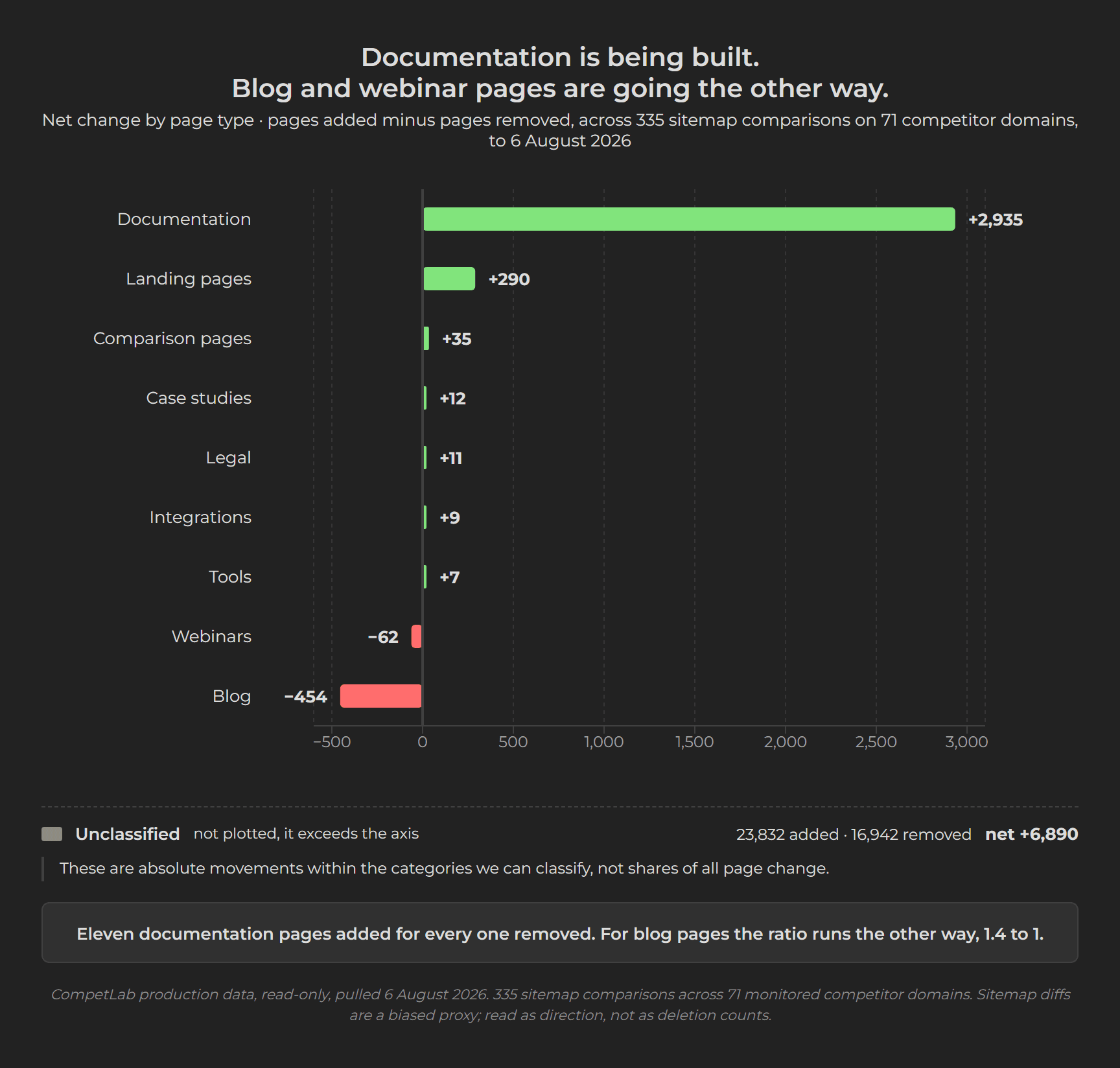
Within what we can classify, documentation was added roughly eleven times as often as it was removed, and blog pages were removed about 1.4 times for every one added. Competitors are pruning marketing content and building documentation. Note the shape: 3,222 new documentation pages is volume publishing, and we have argued that publishing more content can cost you AI visibility when several pages cover the same ground. Documentation may be where volume does not cannibalise itself, because each page answers a different question. Untested, and this data cannot tell you their motive either. Read the two as adjacent, not as one confirming the other.
The limit that matters: we are counting a competitor's page list, not their content. That list is often incomplete, it can keep showing pages deleted long ago, and if a company moves its blog from one address to another - /blog/how-to becomes /insights/how-to - our count reads it as a thousand pages deleted and a thousand published when nothing was written or removed. Nor is the direction universal: Glen Allsopp, an SEO researcher, found 64% of 275 SaaS blogs grew their search traffic in 2025, on SEO-tool estimates rather than the companies' own analytics.
Why do teams stop reading their competitor alerts?
Not because the alerts are wrong. Because volume destroys the ability to tell which ones are right, and a person who cannot tell stops opening any of them.
Across five research passes we found no published measurement of what share of competitor alerts go unread, at tool level or industry level. We can offer our own experience of building one of these systems, which is not a measurement but is at least first-hand: five alerts in five days, every one of them marked critical, not one of them worth the interruption. We wrote that up when it happened to us. What else exists is the decay this produces. Wynter, a B2B message-testing firm, surveyed 101 B2B SaaS product marketers on 27 and 28 April 2026 and published in May: 47% of the 101 said their battlecards go stale within three months and 82% within six. Two per cent said theirs last more than a year. In the same survey, only 14% of them named dedicated competitive intelligence tools as a source they rely on. Reddit scored 23%, and 21% named ChatGPT, Claude or Gemini. The category's own buyers are routing around the category's own products. One senior product marketer told them, of the two best-known vendors in it:
"I haven't seen any CI tools worth the investment. I can replicate most of what Crayon and Klue do with an agent in Claude."
For the mechanism itself, the honest move is to borrow a measurement from a field that has done the work and to say plainly that it is borrowed. Alarm fatigue in clinical and security operations is measured properly, and the shape is consistent.
| Field | What was measured | Result |
|---|---|---|
| Intensive care | 5,147 alarms observed in an adult ICU, about 43 an hour | 42.5% received no response at all |
| Intensive care | A review pooling 32 studies across ICU and ward settings, 2015 | Under 1% to 26% of alarms in adult intensive care were worth acting on |
| Security operations | 350 analysts and managers surveyed by IDC, commissioned by FireEye, reported 2021 | 45% of in-house alerts are false alarms, 53% at outsourced providers; more than a third of analysts ignore alerts when the queue fills |
The intensive care observation is the one to sit with, because that unit's alarms were not mostly trivial: 49.8% carried medium clinical relevance and 7.5% high. The study does not report which alarms went unanswered, so nobody can say the important ones were the ones ignored. What it establishes is the condition. At 43 an hour, in a stream where the consequential ones are genuinely mixed in with the rest, sorting is not realistically possible.
These are different domains with different stakes, and none of them is a measurement of competitor tracking. The transferable part is the mechanism, not the number: when a channel mixes consequential and inconsequential events at similar volumes, people stop triaging and start ignoring. A tool that sends you every detected change is building that channel on purpose.
One more disclosure before the fix. CompetLab produced the 155 alerts above, and we are not exempt from the point. Ninety of them were content growth, which is to say a competitor published something. That is not an emergency and it should not arrive as one. The reason we sort every change by type before it goes anywhere is that the sorting is what makes the monthly kill list in step 6 possible, and step 6 applies to us as much as to anyone else.
How should you triage competitor changes?
Score by consequence, not by novelty, and route by consequence too. Three categories are enough, and the test for each one fits in a sentence.
| Category | The test | What it looks like on the page | Our alert types | Share of our 155 |
|---|---|---|---|---|
| Deal-altering | A rep has to answer for this in a live deal this quarter | A price moves, a plan is renamed or restructured, a feature crosses between tiers | price change 8 + pricing signal 5 + feature toggle 2 | 15 alerts, 9.7% |
| Positioning-altering | It changes who they sell to, or what they claim to be | The headline, the audience line, the category label or the main call to action changes | positioning change 25 + messaging shift 11 | 36 alerts, 23.2% |
| Watch-list | It only means something in aggregate | They published, deleted or reshuffled content; a tech or security signal moved | content growth 90 + removal 9 + reorganisation 3 + tech stack 1 + behavioural protection 1 | 104 alerts, 67.1% |
When a change passes two tests, take the higher one. A competitor renaming a tier from Growth to Scale is both a packaging move and a positioning move, and you will hit that case in your first week. The rule that resolves it: if a rep has to handle it in a live deal this quarter, it is deal-altering, whatever else it also is. Categories exist to route work, not to describe reality accurately.
Sorting our own alert types into those three is our judgement, not something the data decides. But look at where the volume sits. Two thirds of everything we detect belongs on a watch-list, and that is the useful part rather than the embarrassing one. One competitor blog post is noise. Forty of them in a quarter, all on one topic, is a strategy, and you can only ever see it by letting them pile up somewhere quiet instead of firing each one at a person.
Here is the sequence that puts those categories to work. It combines three published practitioner frameworks we have not seen combined anywhere, plus the two rules our own alert mix argues for.
- Decide your categories before any alert arrives, not after. The three above come from Stratridge, a B2B marketing platform. The question it puts to every signal is "does this change anything we're doing?" That does more work than any severity score, because it cannot be answered by staring at what changed on the page. Every alert lands in exactly one category.
- Name the artifact each category must change. Deal-altering changes a battlecard. Positioning-altering changes a positioning brief, a launch plan, or your written view of why you win and lose deals. Watch-list changes nothing this week. An alert that cannot name an artifact is not an alert, it is a fact.
- Require two source types before anything reaches a sales rep. A sales call plus a pricing page, not two readings of the same page. This one rule does most of the work, and it costs nothing: it is what stops a single ambiguous copy change from becoming a fire drill. If you want a fuller gate, TicNote publishes a rubric that scores each signal one to five on confidence, impact and actionability and escalates only at ten out of fifteen. Worth having if your volume justifies it, and skippable if it does not.
- Tier the cadence, do not tier the volume. Elevated Signal publishes a good default: daily for pricing and key product pages, weekly for ads, hiring, news and reviews, monthly for a brief, quarterly for re-deciding who is on the list. We would go further on the top tier. Our own measurement guidance is that daily checking burns effort for no extra signal, and this article is the reason why: a daily watch on a pricing page mostly catches a page that moved rather than a price that did. Weekly is where most schedules already land - 53.8% of the 65 in our data.
- Watch the words, not just the numbers. Our mix puts 23.2% of detected movement in positioning and messaging. A monitor that fires when a number changes has nothing to compare on any of it. Watch the homepage headline, the line that names who the product is for, the navigation labels, the main call to action, and the list of what each plan includes - and compare them as text.
- Keep a kill list and use it. Once a month, review the alert types that have never once led to an action and switch them off. Track the share of alerts that produce an action. If that share is falling, the answer is fewer alerts, not more.
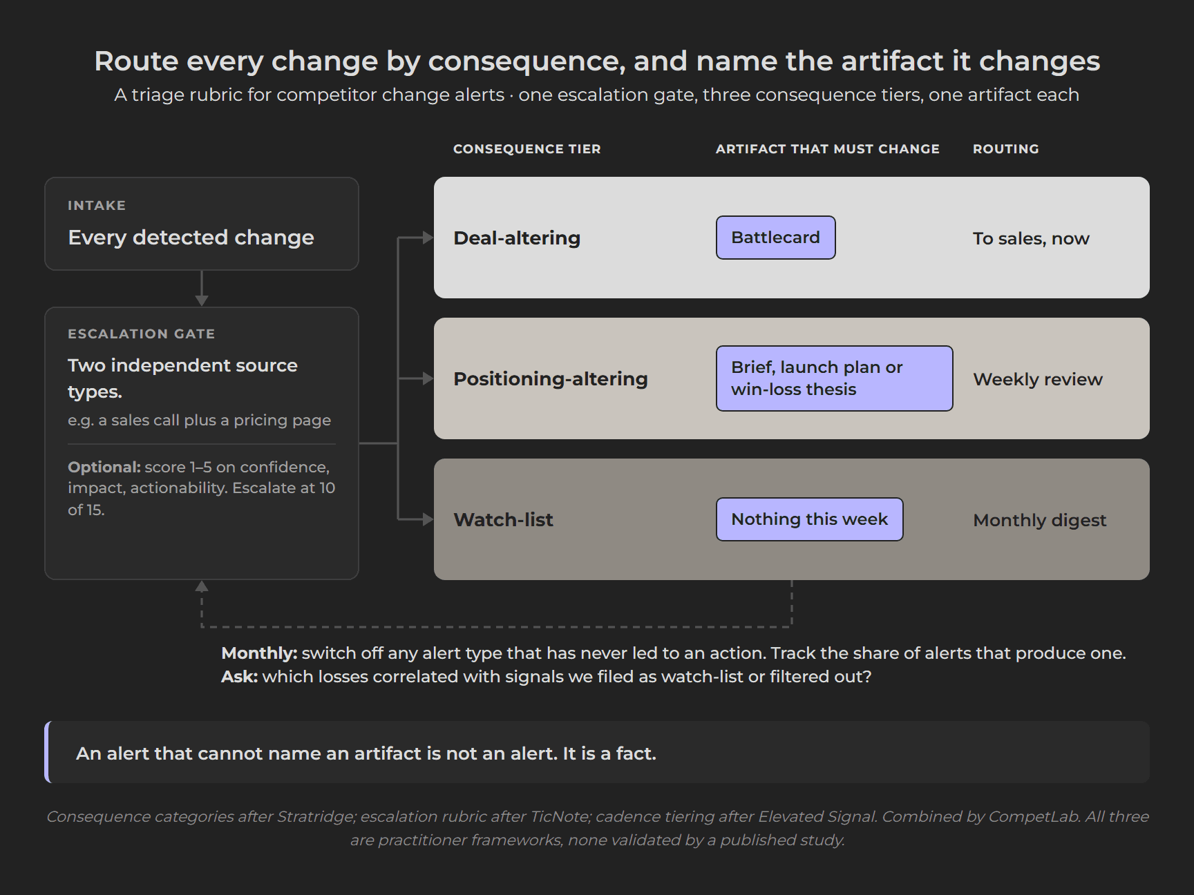
Where those pieces come from, since you should weight them accordingly. The consequence categories and the monthly audit question are Stratridge's. The cadence tiers are Elevated Signal's. The optional scoring rubric is from a guide published by TicNote, a note-taking software company, so it is content marketing rather than field research. In five research passes we found no published test of any of the three. The tiebreaker rule, steps 5 and 6, and the category table are ours, and so is which of our alert types lands in which tier.
A caution on step 1 that the evidence supports directly. Competitor information does change what firms do, and not always for the better. In a field experiment across 3,218 firms, published in the peer-reviewed journal Management Science, the researcher Hyunjin Kim gave randomly selected firms easily available information about competitor prices. The firms that got the information became three percentage points more likely to change their own prices, a 17% relative increase, and the effect was concentrated in the firms whose prices had been furthest out of line. The changes appear to have improved performance. But the direction of movement was toward competitors rather than away from them: given information about rivals, firms aligned rather than differentiated. The study covers personal care businesses, not software, so read the mechanism and not the magnitude. The warning still lands. A monitoring programme that reports everything a competitor does, without a triage step that asks whether you should care, is a machine for making you more like your competitors.
What this data does not show
It does not show that quiet changes cost you deals. We can show they are common and that they travel badly. We cannot show what they do to a win rate. Across five research passes we found no study, controlled or observational, in which a competitor's messaging, positioning or packaging change is the input and a buying outcome is the measured output, and we could not find anyone else who has. What exists is evidence that companies changing their own messaging move their own conversion, which is a different proposition. Treat the link between the two as our reasoning, not as a finding.
The strongest objection: the mix may partly measure our own detector. Spotting that wording changed is easy. Spotting that a price changed means pulling the number off the page, comparing it to the one stored last week, and deciding the difference matters. Those are not equally easy problems, and some of the distance between content's 65.8% and price's 5.2% is difficulty rather than behaviour. We think the direction survives it, because no plausible correction for detector sensitivity turns positioning and messaging into a minority of what moves. But a reader who discounts the exact figures on these grounds is reasoning correctly.
The sample is small and it is ours. 155 alerts across 71 competitor domains, watched on behalf of 24 organisations concentrated in a handful of niches, pulled on one day. A different set of competitors would produce a different mix, and a company that only monitors pricing pages would produce a mix that is nearly all pricing. That is the article's own point turned on itself, and it is fair. We publish our own numbers when they are unflattering too, including our own AI brand visibility, which is still zero across all three engines on the most recent re-test.
The price share rests on eight alerts. Five of those eight were one company changing how it displays its own billing. The 5.2% is stable as a share of what we detected, but nobody should read it as a claim that B2B software prices are static. We have no data either way on how often prices actually move - only on how often the pages carrying them change, which the article has just spent a section arguing is a different thing.
It is a composition, not a rate. These figures are the alert store as it stood on 6 August 2026. They tell you what the mix looked like across that set of monitored competitors on that date. They do not tell you how many changes happen per competitor per week, and the set itself moves as customers add and drop competitors, so a pull on a later date would not reproduce these counts even if competitor behaviour had not changed at all.
The classification is ours, twice over. The ten alert types are our taxonomy, applied by our system, and the sorting of those types into three consequence tiers is an editorial call on top of it. Someone else's categories would cut the same movement differently. We have published the type names, the counts and the component types behind every group, so both cuts are at least traceable. They are not independently checkable: this is proprietary data and nobody outside can re-run it.
None of that touches the finding the article rests on. Whatever you call the categories and however you weight the detector, price is a small share of what a competitor changes, and the words on the page are most of it.
Methodology. Alert and page figures come from CompetLab's production database, read-only, pulled 6 August 2026: 155 classified alerts, 335 sitemap comparisons and 65 monitoring schedules across 71 monitored competitor domains and 24 organisations. Aggregates only; no customer and no monitored competitor is named, which is why the quiet-change patterns are described at the level of the pattern. Shares are of the 155 alerts, and every group names its component types so the arithmetic can be checked. Page counts are absolute movements within classified categories only. Every external figure was opened at its own source on 17 August 2026 and carries its date in the text; the IndustryLens figures are self-described as computed live and refreshed daily, so they will not match later. Clinical and security alarm research is borrowed mechanism from other fields, not a measurement of competitive intelligence.
Want to see what your competitors are actually changing?
CompetLab watches competitor pricing, positioning, content, AI visibility and tech signals, classifies each change by type, and turns it into a prioritised plan rather than a feed of diffs.
14-day free trial. No credit card. Start here.
Frequently Asked Questions
What should competitor tracking actually monitor?
The pages where positioning lives, not just the pages where numbers live. Across 155 classified alerts, 23.2% were positioning or messaging changes: an audience line rewritten, a navigation label changed, a call to action swapped. A monitor that fires when a number changes has nothing to compare on any of those. Watch the homepage headline, the line that names who the product is for, the navigation labels, the main call to action, and the list of what each plan includes, and compare them as text rather than as prices.
Is a pricing page change the same as a price change?
No, and conflating them is the most common error in this category. A pricing page carries plan names, feature bullets, FAQ blocks, trust badges, currency toggles and annual-versus-monthly switches. Every one of those can move without a number moving, which is why a pricing-page alert is a prompt to go and look rather than news in itself. The practical test: does this change what a competitor charges, what they include at that price, or who they will sell it to? If it changes none of the three, it is a page edit, not a pricing move.
How often should you check competitors?
Tier the cadence rather than the volume. Of the 65 monitoring schedules in our own data, 53.8% run weekly, which is the most common choice and the right default. A workable split is weekly for ads, hiring, news and reviews, monthly for pulling it into a brief, and quarterly for deciding who is even on the competitor list. Put pricing on a daily check only if you have actually lost a deal to a price move: a daily watch on a pricing page mostly catches a page that moved rather than a price that did.
Why do teams stop reading their competitor alerts?
Because volume destroys the ability to tell which alerts matter, so people stop triaging and start ignoring. Across five research passes we found no published measurement of this in competitive intelligence, but the mechanism is well measured elsewhere. In one intensive care study of 5,147 alarms, 42.5% received no response at all, in a setting where more than half the alarms carried medium or high clinical relevance. Wynter surveyed 101 B2B SaaS product marketers in April 2026 and 47% of them said their battlecards go stale within three months.
Does monitoring competitors actually change what companies do?
Yes, and not always in the direction you want. In a field experiment across 3,218 firms, published in the peer-reviewed journal Management Science, the firms given easily available competitor price information were three percentage points more likely to change their own prices, a 17% relative increase, with the effect concentrated in the firms whose prices had been furthest out of line. The catch is the direction: they aligned with competitors rather than differentiating. Monitoring without a triage step that asks whether you should care makes you more like your rivals.
Watch your whole market, automatically
Track competitors' pricing, positioning, content and AI visibility — with a monthly Strategic Briefing on what changed and what to do.
Share this article